UMB Physician Assistant Degree:
Online Program Explorer
My Role:
Research & Design
Team:
Sherie Anderson, Laura Bell, & Kristina Ousley
Timeline:
January - May 2022
Course: IDIA 612: Interaction and Interface Design,
University of Baltimore, UX Design Graduate Certificate Program
Problem Space
How can we make the process of learning about the University of Maryland, Baltimore (UMB) Physician Assistant Program and additional certificates, degrees, and future continuing education opportunities, easier for prospective students searching online?
While the client (UMB) identified our focus as the PA program, they also wanted to provide better information about additional education options. We therefore needed to also explore how to make sure a PA student or any other individual might find information about the Ph.D., PALLA program, or additional certificates.
Background
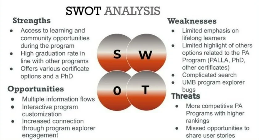
After researching the UMB program and website, PA programs in the U.S., online program explorer tools at various education programs, and PA students and the factors affecting student program selection, we developed an understanding of relevant user heuristics and performed a SWOT analysis.
UMB has a wide demographic of applicants and students, meaning their interests and goals are also diverse. Very few of the top ranked PA schools have online program explorers linked through medical school (or related) websites. Not all schools offer multiple career or education tracks, so the explorer isn’t necessary for them.
UMB is unique. They offer opportunities for incoming, current, or returning students to plan multiple aspects and tracks of their careers. Therefore an online program explorer would be useful for both incoming and current students, and those seeking continuing education.
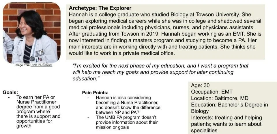
We created 3 user personas to assist us as we developed user pathways in our wireframes.
As we tested our ideas, we asked our test participants to imagine they were a student interested in beginning a PA program or someone interested in continuing education.
The team also explored examples of other program explorers or similar customization tools that allowed individuals to develop what they were looking for out of a service or product through questions. A few examples include St. Petersburg College’s Program Explorer, and Indiana University’s MoneySmarts cost calculator tool, and the Johns Hopkins Business School program explorer.
A short SWOT analysis and competitive analysis comparing UMB with the top PA programs in the U.S., including Duke University, Baylor University, and University of Iowa, gave us a starting point for opportunities for a new online program explorer.
Design Goals
Some of our early design ideas involved more gamification and asked our users to identify and create an avatar within an online tool. Our team focused on a mobile first design, and we envisioned that users would sign in, create an account, and use the Program Explorer as an ongoing resource over time as they learned more and made decisions about their education. But, we quickly decided to simplify our approach and focus on customization options following user pathways where our participants can identify their goals and interests and build a “career pathway” to help them gather information. This made it a simple, one-time-use tool that would help them gather information as they research programs.
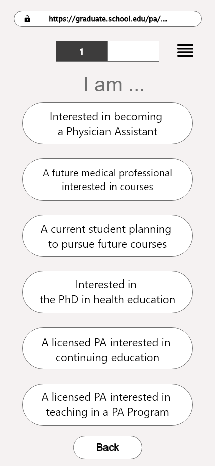
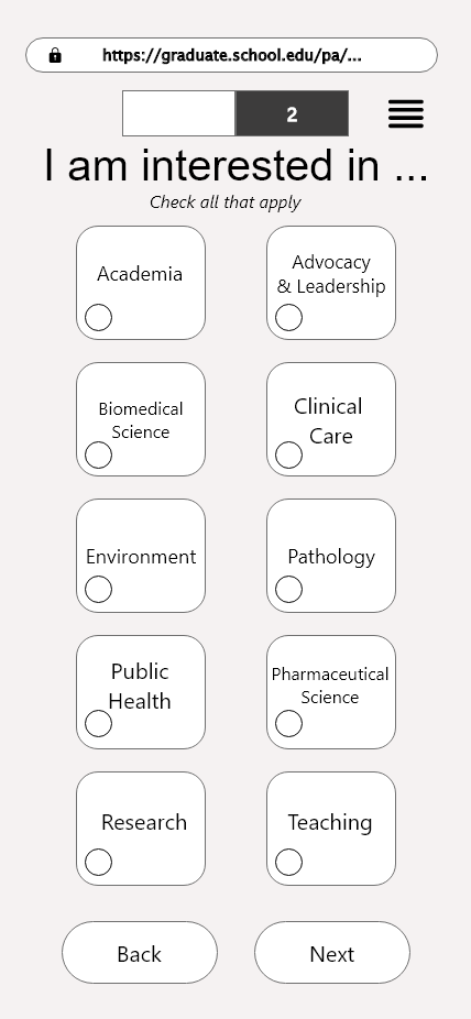
Our team thought creating a series of questions in a simple format would be the best way to help potential students using the tool to navigate through various options and find useful information without limiting their potential pathways.
The goal was for the tool to help them build an educational pathway where they customized which programs they wanted to explore and combine in order to learn more about timelines, costs, and other factors influencing their higher education choices.
Prototyping, Iteration, and User Testing
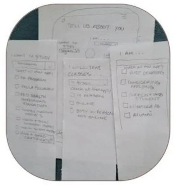
As we solidified our ideas for the interactive program explorer design, we had a number of questions about how potential new students (or other users) might navigate it. The best way to make progress was for us to test and test often. In all, we conducted five moderated tests of our paper prototypes, three rounds of recorded unmoderated tests using our Adobe XD prototypes and UserTesting.com with 9 participants, and one round of moderated tests with the Adobe XD prototype with 3 participants over Zoom all using a think-a-loud protocol.
While working through our design questions about what information would be valuable to users at various points in the customization process, and how well the customization flow itself worked, our team iterated after each test.
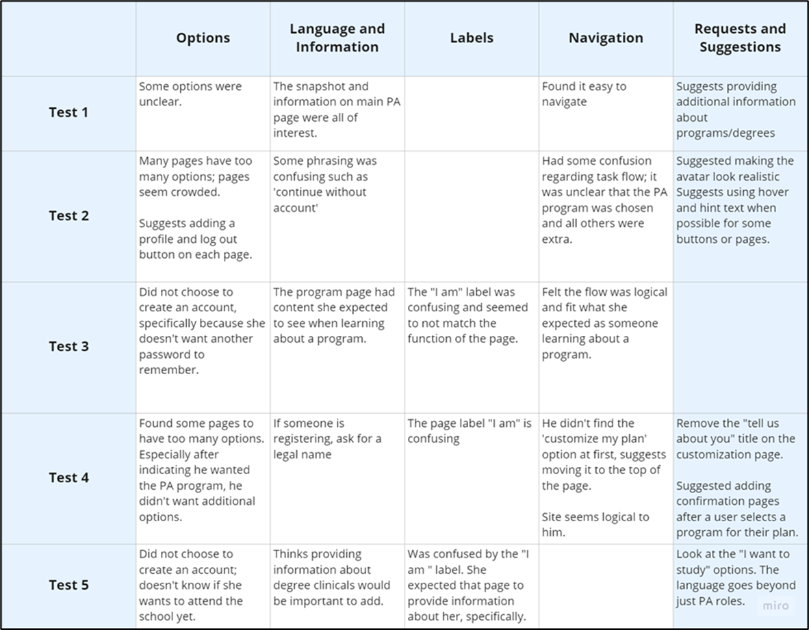
We found that the phrasing, labels, and navigation were our biggest hurdles in our early iterations.
Paper prototype tests feedback grid.
Some of our most valuable feedback during the paper prototype tests came from our final test participant who was a working medical professional and mentor to younger health professionals. She gave us valuable insight into the format of medical education, the steps and preparation involved, and the preparation needed. Her input informed some of our phrasing, language, and labels, and led us to look to the UMB Nursing School program explorer as another example.
While our initial paper prototypes attempted to ask users to create an account, select an avatar, and answer questions to customize their program, these steps were clearly a bit confusing. Some of the feedback we got showed that the amount and location of information, the button placement, and sometimes the customization process itself could be too complicated for users.
We simplified our design with the goal of making our customization pathways easy to understand while still providing valuable information.
Our Design
We completed a number of iterations as we continued testing our customization flow and mobile design with test participants.
Our user feedback led us to revise label language and button placement. We also revised the layout in order to draw the users’ eyes to useful information quickly. The tests also led us to revise some of our task language for clarity.
We found that hint text was key for mobile users, that button placement would influence how easily they could navigate backwards or forwards in the customization process, and that progress labels were key to navigation.
If you’d like to see more of the updates we made between iterations, you can view an early version of our design and compare it with our final low-fidelity prototype design both made using Adobe XD.
(Apologies for any glitches with Adobe XD)
Conclusion
The team learned a lot about the complexity of creating a useful and enjoyable customized pathway using this kind of tool. In the end, our final takeaways were that a successful online program explorer would:
Use succinct language and hint text to guide users
Include multiple pathways to find similar information
Group content by user goal or subject area
Utilize intentional button placement, and make it easy for users to ‘go back’ or start over
We summarized our findings and grouped suggestions according to immediate, short-term, and long-term goals. Our client appreciated our findings, and it seems their new online tool uses some of the concepts we emphasized.
My Part
This was my first project using Adobe XD, so I was grateful to my teammates for the opportunity to try my hand. I also did my best as the illustrator for our paper prototypes. My other contributions were to the the background user research, persona creation and user flow design, research process, tasks writing, and analysis of the outcomes of our usability tests.


