Washington County Free Library
My Role:
UX Designer & Researcher
Teammate:
Kathryn Summers, Ph.D., Principle Investigator and Team Lead
Timeline:
June - October 2022
Methods: Participant interviews; tree testing; usability study; website redesign
Project Goals
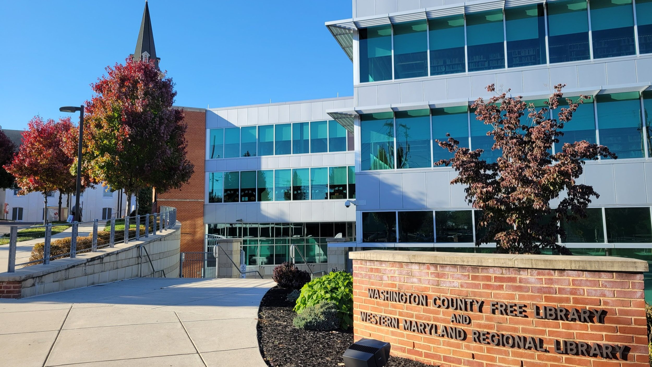
Washington County Free Library (WCFL), the public library system of Washington County, Maryland, serves a population of over 154,000. The library holds a key role in the local community with a mission to connect people with information, ideas, and services.
In 2022, WCFL sought to better understand the needs of their website users and to ensure that patrons visiting the website had a useful and productive experience. The library’s goal was to identify which aspects of their website were in the most need of a redesign.
Our team of two UX researchers aimed to understand how users interacted with the library and how the website could better serve their unique purposes through an updated design and information architecture. We began by learning about the library’s user communities. We then designed and proposed a new website IA with design revisions that would fit the functional needs of our client and their different library patrons while also providing an enjoyable experience. Last, we tested our prototypes with library users through moderated in-person and online usability testing.
Background Research
Given our stakeholder goals from the library, our first step was to better understand what library users think about and expect from their interactions with the WCFL website. This included research into library website trends, a SWOT analysis, a Competative (Peer) Analysis of other Maryland public library websites, and a content inventory of the current website. As a librarian/archivist I also have professional experience using library websites to work with students and archives researchers. This provided me with helpful background knowledge and understanding of how librarians tend to think and present information to library patrons.
For our peer analysis, I examined current examples of Maryland public library websites. I later also looked at a few websites of other major public libraries located around the United States including the New York Public Library.
The SWOT Analysis allowed us to identify the ways the library’s website could better assist users achieve their various goals while also documenting known weaknesses and strengths.
Competitive Analysis
SWOT Analysis
Library and Website Discovery
The Washington County Free Library website homepage shown to the left in two screenshots had an abundance of information available to users.
Hypothesis
With so much information available, navigation and decision-making can daunting for library patrons. Many of the website’s pages had a similar amount of information as those shown here. We suspected patrons may be overwhelmed and have difficulting finding information on the website.
Next Steps
After compiling a partial content inventory for the website to gain a better understanding of its current organization, page purposes, etc., we needed to talk with current library users. How does the library serve their needs and fit into their common library-related activities?
Interviews
In June 2022, Kathryn and I conducted 34 in-depth interviews in-person at the Hagerstown main branch of WCFL and remotely using Zoom.
WCFL identified their main user groups as students, job seekers, homeschoolers and stay-at-home parents, and recreational library users. We condunted 24 interviews with recreational library users, job seekers, students, and library staff in-person and 10 remote interviews via Zoom with parents who were stay-at-home and/or who homeschool their children. Kathryn and I took turns acting as the interviewer and as the notetaker. We also recorded the interviews for later review.
Interview Insights
Current Website
Patrons generally only use the catalog, not the main website
If patrons discover a resource, it’s generally through interaction with staff
Most often, patrons learn about events on social media, or less often, in-person
Patrons experience the physical library as a welcoming space; online experiences are less positive
Patron Needs
Opportunities to discover (and later re-find) valuable resources. We frequently heard a pleased “Oh! I didn’t know the library had that!”
Easier pathways between the main website, catalog, and events calendar, to facilitate discovery
Opportunities to connect with librarians
Opportunities to build community connections
IA and Website Design Goals
Help people see themselves on the website
Don’t overwhelm users with information
Provide information pathways
Personas and Journey Mapping
Using the insights from our numerous interviews, I took the lead in creating user personas and journey maps for each of our library user groups. Organizing the information we learned during our interviews, our team was able to better understand the needs and pain-points of different patrons.
While I still organized the personas and journey maps by library user type, I also organized them by library use level, which ranged from Basic User to Expert User. The patron needs we identified through analysis of the interviews and by creating our journey maps informed our recommendations for an updated information architecture.
Information Architecture and Tree Testing
Using what we learned from our user interviews in addition to the review of other public library websites, our team revised our proposed IA for the website. While we knew there was a significant amount of information to make available for library patrons through the main navigation, we focused on identifying clear labels and hierarchies that would serve the needs of our various user groups.
Kathryn then took the lead in running Tree Testing online using Optimal Workshop’s Tree Jack tool. We found that overall, the Tree Test participants found our IA useful and effective. However, given some of the results we also determined that some information could and should be located in more than one location in the IA in order to promote ease of use.
Tree Test Highlights
Task 3: Testers were confused about labels we had used, specifically online resources vs. research guides
Task 7: Testers expressed confusion about the age ranges we used to denote ‘middle school,’ and 3 individuals chose to view “tech classes” and didn’t realize this might be different from “STEM” event.
Task 8: Our testers tried a lot of different options to complete this task. This told us the IA wasn’t clear enough. Some individuals tried the Catalog, the Learn from Home page, Events, the Digital Library page, and others.
Prototype and Usability Testing
To finalize the IA and Wireframe Designs: the team used our review of other public library websites and our identified goals, in order to create basic sketches for wireframe designs. These ideas served as a starting point for iterating on our ideas for our clickable prototype.
Designing High Fidelity Prototypes: I used Figma to design high fidelity prototypes for our age-focused pages, homepage, and other pages of high importance. These prototypes underwent multiple iterations as the team incorporated design ideas, revised information pathways, and aligned them with the proposed IA.
Reviewing with Stakeholders: The team shared our prototypes with library leadership, who provided reassurance that our design direction was on the right track. Their feedback helped validate key decisions and provided valuable insights for questions we were still grappling with, such as labels and information flows.
Conducting Usability Testing: To evaluate the usability of our hi-fi prototype, the conducted moderated usability testing online using Zoom. Thirteen participants representing different user groups, such as parents, recreational users, and job seekers, were included. Each participant performed 7-11 tasks based on their user type.
Iterating Based on User Feedback: User feedback from the usability testing played a crucial role in refining our remaining design decisions. We iterated on several of our page designs, made final revisions to the proposed IA, and solidified our information pathways for various library user age groups.
Throughout this process, we engaged in an iterative design process that incorporated user feedback at multiple stages. This approach helped us create a user-centered library website prototype that met the needs of your various user groups and our stakeholders.
Home Page
Our home page highlighted information pathways created specifically for users based on age group while also highlighting the most relevant resources patrons need.
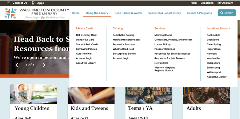
Mega-menu
Secondary menus for each global navigation category allow resources to be visible while still being organized in ways that allow patrons to focus on the options that interest them.
Topic Hierarchy
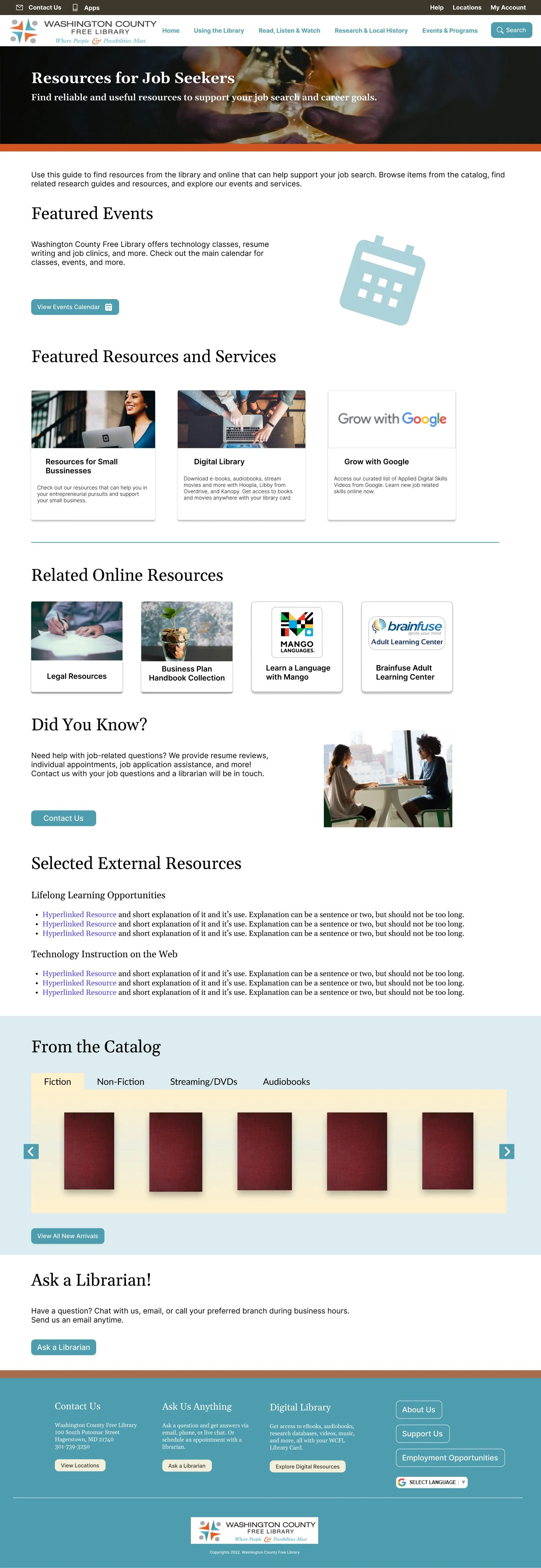
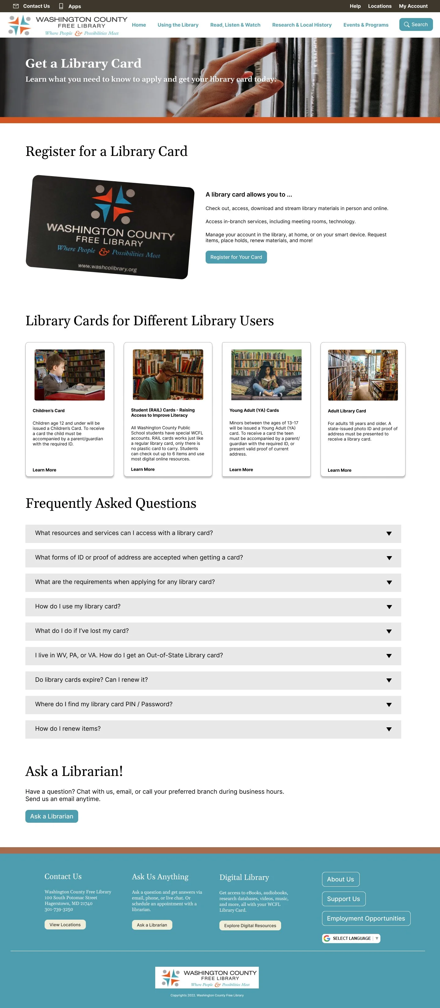
Each user group can navigate to their own area on the website to find resources curated specifcally for them. In all I made 4 pages for our user information pathways including one for adults, Teens, Tweens, and Young Children.
Testing the effectiveness of the pages as our test participants completed tasks helped us solidifiy and iterate on our ideas in addition to helping us refine labeling and wayfinding for our users.
When the team presented our designs to the WCFL administration and library staff we showed our designs in the order various library patrons would encounter each page while trying to complete every-day tasks. Our presentation was well received. And we were told that while the exact designs may not be used, the information architecture, visual organization, and emphasis on user pathways would be useful as the migrate their website to the latest version of Drupal.
In addition to the examples below, I also built prototypes of the library’s calendar page and online catalog page for use during testing. One particularly significant finding for us was that users needed those two pages, which are built on separate content management systems, to be better integrated with the website so that they can find and learn about relevant resources both through them and through the main website.
Conclusion and Learning
Throughout this project I wore a number of hats. In addition to working my full-time job as an archivist, my contributions to this project included roles such as project manager, researcher, and designer. I managed interview and usability test scheduling; drafted questions and tasks; conducted interviews and usability tests with diverse user groups. I also created journey maps, personas, prototypes, wireframes, and contributed to the final design. Miro helped to build our user personas and journey maps and Figma was used for the wireframes and click-through prototype.
I learned a lot about how public library patrons in this part of Maryland utilize the physical library and how a website can help improve their experiences. During the usability tests, we frequently heard individuals reading through our designs say “I didn’t know the library had that.” Library patrons care about and value their library, and this proposed redesign can further improve their experiences.


